
Most composer websites bury what performers look for
Conductors and performers aren't judging your design skills. They're scanning for something specific, and most composer sites bury it completely. Here's the rubric I use to evaluate websites, the mistakes I saw on 5 of my subscribers' sites, and exactly what I'd do to fix them.
 By Saad Haddad, composer
Here's the video this post comes from (31 minutes), or you can read it below.
- The 4 things that actually matter to performers
- Credibility: can I tell that you're a composer?
- Direction: where am I supposed to go?
- Simplicity: is it easy to see what your pieces are?
- Access: how are they going to get in touch with you?
1. The 4 things that actually matter to performers
Most composers design websites that obsess over things that don't actually matter to performers. So I built this rubric around the 4 things that actually do.
I rated 5 of my subscribers' websites on all 4 parts of the rubric using a traffic light. Red means a total redesign is going to be needed. Yellow means there are some improvements that could be made to what's already there. Green means you only need small changes, or you're totally good to go.
Direction is where I gave 2 of the 3 red lights. The great thing is that the fixes to common website problems mostly take an afternoon of work, not a total redesign.
2. Credibility: can I tell that you're a composer?
I start off with credibility, which is the most important thing, because that's what people see when they first hit your site. It measures how immediately a visitor can tell that you're getting your music played by real people.
On one site, I was a bit confused, to be honest, as soon as I got there. I couldn't tell immediately what the composer does. I saw it in words, but I didn't see it in terms of imagery, or in terms of anything immediately visceral.
If I was somebody that landed on that site, it would take me probably 3 or 4 seconds to understand what this person does. We want to understand what you do immediately.
On another site I saw a cello up on the top left. It's got a nice, light, breezy aesthetic, but it wasn't obvious to me that this person is a composer, even though the bio says composer first and cellist second. Once I scrolled down, I saw some nice images, with what looks like a choir and some images of conducting. All of them were quite good, but I would've liked to see them a little bit higher.
And one had a nice photo, with a nice tie. I wish I could make my tie look that good. But it's kind of like a normal businessman sort of photo. It doesn't show the composer with musicians, or their work with composition.
Show some evidence
I'd like to see some evidence that you're in front of an ensemble. If that's not possible to get as a picture, then maybe you holding some manuscript paper, or writing on it. Something that shows that you're a composer.
I can't tell immediately what you do
Hey, this is a composer
For comparison, I showed everybody my own homepage. You don't need a picture like this, but something to this effect would be really, really nice.
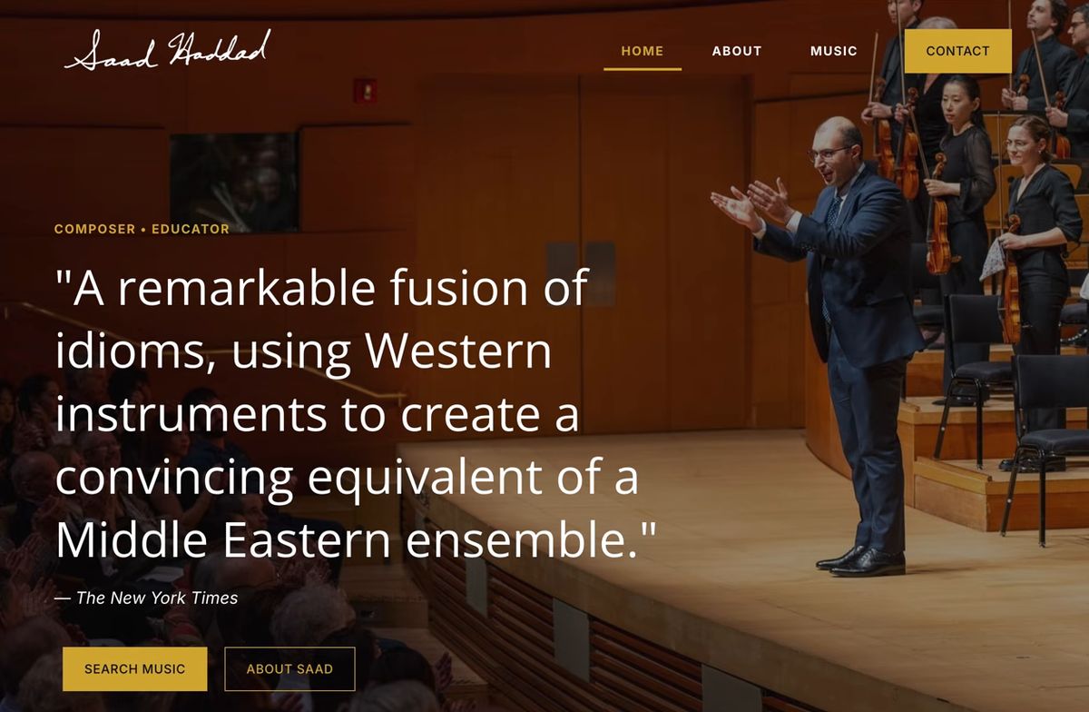
One composer had 4 YouTube videos on the homepage that immediately showed me that this person has written music for live musicians. I gave that a green light right off the bat.

The best quote to put up there
One site had a quote at the very top, and my eye went straight to it. It mentioned 3 composers, and I'm not sure if an average performer going on the site would recognize any of those 3 names.
I would've preferred maybe a quote from a magazine. Or if it's from a composer, a composer that's a bit more well known, that the general performer public would know.
Another site had a carousel of scrolling quotes. I haven't thought to do that myself, but that's pretty cool. I just wish the quotes were maybe 50% shorter, because it's quite a lot to read very quickly.
There was an orchestra there too, and I would've liked to see it a little bit higher, because I just saw a bunch of black and the text. If you move it up, you can still get the quote and the orchestra in the same shot.
3. Direction: where am I supposed to go?
Direction, in other words: do I know where to go next when I'm on this homepage? Because if I don't know what to do immediately, I'm probably just going to click off and go on Facebook or something.
- 1They land on itThey see your homepage for the first time.
- ?Do I know where to go next?If I don't, I'm probably going to click off and go on Facebook.
- 2Search music, explore musicA really simple button that goes straight to your compositions page.
- 3They start diving inSeeing what you have.
The site that got a green light had 2 big buttons that said chamber and large ensemble. To me, that's what the website screams: there's either this option to look at chamber music or large ensemble music. What I'd do personally is also have an option to learn more about you as a composer, and a contact button that's clearly visible.
So many tabs
Seeing so many tabs on a composer website is kind of one of my pet peeves.
On one site I saw a lot of tabs, and I didn't know where to go next. In the "more" section there's quite a bunch of things, too many things to click at. So my inclination was to start scrolling. I'm scrolling, I'm reading, but I'm not sure if this is what the composer wants me to do.
On another site, the one button besides home said "additional pages." If I didn't put my mouse over it, I really honestly would've had no idea where to go. Both of those sites got a red light.
There needs to be some singular direction in the website where you're basically curating an experience.
How to fix it
I'd try to condense it to maybe the 2 or 3 most important things. When I made the video, it was really 3 tabs on my site: about, music, contact. The home tab doesn't even count, because you're already there.
Another site had so many tabs. I believe that really, any of these things can be buried in one of those 3 tabs, and you can call the music tab "works" if you want to be more general about it.
Its own dedicated page
All that stuff could be in here
These could be in the contact area
Then, somewhere on the homepage, have a couple of really simple buttons, like "search music" or "explore music," that go straight to your compositions page. That's what I had on my site: click "search music" and it goes straight to my catalog, and people can just start diving in.
I'd also like to see a bit more obvious direction on what you'd want your first-time visitor to see. Do you want them to go through your music? Your installations? Your research? It's a curation process.
4. Simplicity: is it easy to see what your pieces are?
For this one I go into the music. I want to see what your music is like. That's going to be the most important thing.
On the first site, I clicked on a flute quartet, and I saw the year, the duration, when the premiere was, who it was by, the program note and some recordings. If somebody was playing the flute and wanted to learn more about this piece, it's incredibly simple and incredibly straightforward.
On another site I clicked on a set of songs. I saw the instrumentation, the year and the movement titles, and I didn't have a way of learning more. It's hard for me to understand how the composer thought of setting them. What do these pieces mean to you?
I also didn't see where the rest of the catalog is, so that's why I gave it a red light.
What do these pieces mean to you?
Very, very straightforward
I've shown how to present each of your pieces on your website in how to self-publish your music.
Let them see and hear it
One composer had a page where I could see all the scores. I've never seen anybody present their music quite like this, but it's so visual. I clicked on one piece and it had some sample scores. I quite like it, because immediately I kind of have an idea of what the piece is without even having to listen to it.
The recording was further down, though, and I could have easily missed it. I'd move the recording up, so that we can get an idea of what the music sounds like immediately, not just the score.
Create a funnel
One catalog was a huge wall of text, very hard to read. I clicked on something, and there was another wall of text. It's very hard for me to wrap my head around where I want to go, because there's just so much information on the page.
I would've just preferred to see the piece and who it's for on the catalog page. I don't need to see all the rest yet. If I'm interested in the piece, I'll click on it, and then you can give me more information on the next page.
That way you create what I call a funnel, and people aren't just bombarded with information from the very beginning.
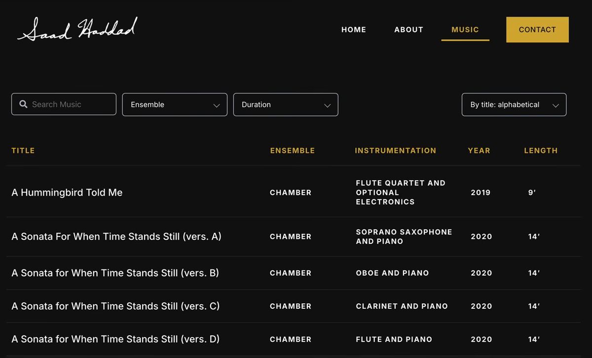
The same goes for your homepage. A huge block of text is something I'm not going to read when I'm first on your page. I might read it later on, when I'm more interested in you.
Your bio shouldn't look like a brochure
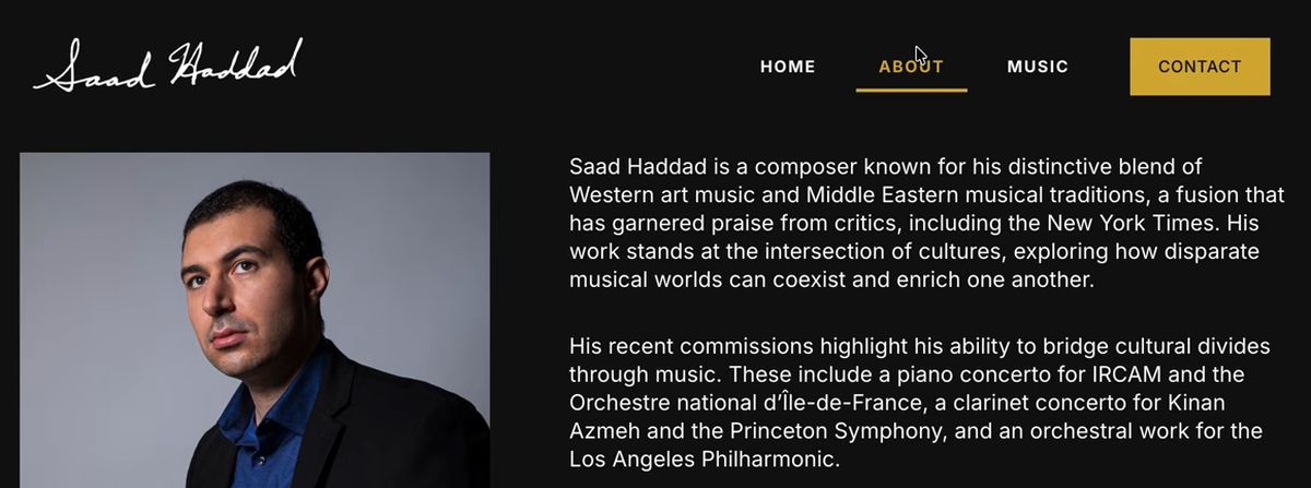
One biography page was laid out like a brochure. As soon as I hit it, I got a bunch of black ink, basically, instead of the bio. I had to be patient and scroll down.
I'd rather have one simple page that just has your biography right up there. On the about page I showed, bam, you get my picture and you get the text, and that's it.
5. Access: how are they going to get in touch with you?
Access measures how easy it is for people who want something more from you, like getting in contact or requesting a perusal score, to take the next step. If somebody was on your site and said, "Hey, I want to play a choir piece," how are they going to get in touch with you?
On one site I didn't see an obvious way, so I had to poke around. I tried the music pages, then I clicked on info, and it was all the way on the bottom, under the statement and the bio. It took me maybe 15 seconds to find it.
On another site I had to know to go to "more" and click on contact. Contact is probably the most important tab. It should have its own dedicated button, so that performers and conductors that are interested can get in touch with you very, very easily.
And as soon as I hit that contact page, a bunch of music just started blaring out of the speakers. There's a time and place for that, and that's when I'm browsing your music, not when I'm trying to contact you.
Eliminate as much friction as humanly possible
When people contact you, you want to eliminate as much friction as humanly possible. One form asked for a category. Unless you're getting 20 or 30 messages a week, you probably don't need to categorize things. You'll get the information you need just by what they say in the subject and the message.
One contact page also had an opt-in to emails. That's a nice touch. I can easily be on your newsletter, and you can send me updates periodically.
Are the scores easy to see?
I know a lot of composers don't like to put their scores up online. That's up to you. Me personally, I like doing it. On one site it wasn't the whole score, but that's okay. It gives me an idea of whether I'd like the piece or not, just seeing this.
On another site I clicked on a link for published work and it said not found. This sometimes happens when you have published music, so you need to double check that.
What to do next
If you're already mentally applying this rubric to your own site, my free website checklist takes you deeper into each section, so you know exactly what to look for. And since your website is where your music lives and meets new musicians, here's my process for composing a piece in 4 steps.